 小洛的前端技术博客
Appearance
封装命令式消息提示组件(v2/v3)
跟命令式弹窗组件一样
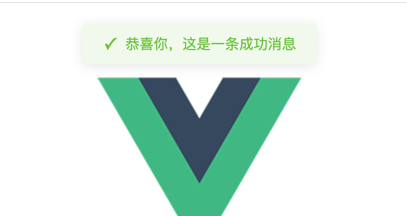
效果:
vue2版
components/Message.vue组件模板代码
已折叠 点击查看组件代码
vue
<template>
  <transition name="message-fade">
    <div v-if="visible" class="message" :class="typeClass">
      <i class="message-icon" :class="iconClass"></i>
      <span class="message-content">{{ message }}</span>
    </div>
  </transition>
</template>

<script>
export default {
  name: 'Message',
  data() {
    return {
      visible: false,
      message: '',
      type: 'info',
      duration: 3000,
      timer: null
    }
  },
  computed: {
    typeClass() {
      return `message--${this.type}`
    },
    iconClass() {
      const iconMap = {
        success: 'icon-success',
        warning: 'icon-warning',
        error: 'icon-error',
        info: 'icon-info'
      }
      return iconMap[this.type]
    }
  },
  methods: {
    show(options) {
      if (typeof options === 'string') {
        this.message = options
      } else {
        const { message, type = 'info', duration = 3000 } = options
        this.message = message
        this.type = type
        this.duration = duration
      }
      this.visible = true
      this.startTimer()
    },
    startTimer() {
      if (this.timer) {
        clearTimeout(this.timer)
      }
      this.timer = setTimeout(() => {
        this.visible = false
      }, this.duration)
    }
  },
  beforeDestroy() {
    if (this.timer) {
      clearTimeout(this.timer)
    }
  }
}
</script>

<style lang="less" scoped>
.message {
  position: fixed;
  top: 20px;
  left: 50%;
  transform: translateX(-50%);
  padding: 10px 20px;
  border-radius: 4px;
  display: flex;
  align-items: center;
  font-size: 14px;
  z-index: 2000;
  background: #fff;
  box-shadow: 0 2px 12px 0 rgba(0,0,0,.1);

  .message-icon {
    margin-right: 10px;
    &::before {
      font-size: 16px;
    }
  }

  &.message--success {
    background-color: #f0f9eb;
    color: #67c23a;
    .message-icon::before {
      content: '✓';
    }
  }

  &.message--warning {
    background-color: #fdf6ec;
    color: #e6a23c;
    .message-icon::before {
      content: '!';
    }
  }

  &.message--error {
    background-color: #fef0f0;
    color: #f56c6c;
    .message-icon::before {
      content: '×';
    }
  }

  &.message--info {
    background-color: #f4f4f5;
    color: #909399;
    .message-icon::before {
      content: 'i';
    }
  }
}

.message-fade-enter-active, .message-fade-leave-active {
  transition: opacity .3s, transform .3s;
}

.message-fade-enter, .message-fade-leave-to {
  opacity: 0;
  transform: translate(-50%, -100%);
}
</style><template>
<transition name="message-fade">
<div v-if="visible" class="message" :class="typeClass">
<i class="message-icon" :class="iconClass"></i>
<span class="message-content">{{ message }}</span>
</div>
</transition>
</template>
<script>
export default {
name: 'Message',
data() {
return {
visible: false,
message: '',
type: 'info',
duration: 3000,
timer: null
}
},
computed: {
typeClass() {
return `message--${this.type}`
},
iconClass() {
const iconMap = {
success: 'icon-success',
warning: 'icon-warning',
error: 'icon-error',
info: 'icon-info'
}
return iconMap[this.type]
}
},
methods: {
show(options) {
if (typeof options === 'string') {
this.message = options
} else {
const { message, type = 'info', duration = 3000 } = options
this.message = message
this.type = type
this.duration = duration
}
this.visible = true
this.startTimer()
},
startTimer() {
if (this.timer) {
clearTimeout(this.timer)
}
this.timer = setTimeout(() => {
this.visible = false
}, this.duration)
}
},
beforeDestroy() {
if (this.timer) {
clearTimeout(this.timer)
}
}
}
</script>
<style lang="less" scoped>
.message {
position: fixed;
top: 20px;
left: 50%;
transform: translateX(-50%);
padding: 10px 20px;
border-radius: 4px;
display: flex;
align-items: center;
font-size: 14px;
z-index: 2000;
background: #fff;
box-shadow: 0 2px 12px 0 rgba(0,0,0,.1);
.message-icon {
margin-right: 10px;
&::before {
font-size: 16px;
}
}
&.message--success {
background-color: #f0f9eb;
color: #67c23a;
.message-icon::before {
content: '✓';
}
}
&.message--warning {
background-color: #fdf6ec;
color: #e6a23c;
.message-icon::before {
content: '!';
}
}
&.message--error {
background-color: #fef0f0;
color: #f56c6c;
.message-icon::before {
content: '×';
}
}
&.message--info {
background-color: #f4f4f5;
color: #909399;
.message-icon::before {
content: 'i';
}
}
}
.message-fade-enter-active, .message-fade-leave-active {
transition: opacity .3s, transform .3s;
}
.message-fade-enter, .message-fade-leave-to {
opacity: 0;
transform: translate(-50%, -100%);
}
</style>plugins/message.js挂载组件
js
import Vue from 'vue'
import MessageComponent from '../components/Message.vue'

const MessageConstructor = Vue.extend(MessageComponent)

let instance
let instances = []
let seed = 1

let Message = function(options) {
  let id = 'message_' + seed++

  const container = document.createElement('div')
  container.id = id
  document.body.appendChild(container)

  instance = new MessageConstructor({
    el: container
  })

  if (typeof options === 'string') {
    options = {
      message: options
    }
  }

  instance.show(options)
  instances.push(instance)

  return instance
}

;['success', 'warning', 'info', 'error'].forEach(type => {
  Message[type] = options => {
    if (typeof options === 'string') {
      options = {
        message: options
      }
    }
    options.type = type
    return Message(options)
  }
})

export default Message
import Vue from 'vue'
import MessageComponent from '../components/Message.vue'
const MessageConstructor = Vue.extend(MessageComponent)
let instance
let instances = []
let seed = 1
let Message = function(options) {
let id = 'message_' + seed++
const container = document.createElement('div')
container.id = id
document.body.appendChild(container)
instance = new MessageConstructor({
el: container
})
if (typeof options === 'string') {
options = {
message: options
}
}
instance.show(options)
instances.push(instance)
return instance
}
;['success', 'warning', 'info', 'error'].forEach(type => {
Message[type] = options => {
if (typeof options === 'string') {
options = {
message: options
}
}
options.type = type
return Message(options)
}
})
export default Messagemain.js全局注册组件
js
import Message from './plugins/message'
Vue.prototype.$message = Message
import Message from './plugins/message'
Vue.prototype.$message = Message页面调用
vue
<template>
  <div class="hello">
    <button @click="showSuccess">成功消息</button>
      <button @click="showWarning">警告消息</button>
      <button @click="showInfo">提示消息</button>
      <button @click="showError">错误消息</button>
  </div>
</template>

<script>
export default {
  name: 'HelloWorld',
  props: {
    msg: String
  },
  methods: {
    showSuccess() {
      this.$message({
        message: '恭喜你,这是一条成功消息',
        type: 'success'
      });
    },
    showWarning() {
      this.$message({
        message: '警告,这是一条警告消息',
        type: 'warning'
      });
    },
    showInfo() {
      this.$message('这是一条提示消息');
    },
    showError() {
      this.$message.error('错误,这是一条错误消息');
    }
  }
}
</script><template>
<div class="hello">
<button @click="showSuccess">成功消息</button>
<button @click="showWarning">警告消息</button>
<button @click="showInfo">提示消息</button>
<button @click="showError">错误消息</button>
</div>
</template>
<script>
export default {
name: 'HelloWorld',
props: {
msg: String
},
methods: {
showSuccess() {
this.$message({
message: '恭喜你,这是一条成功消息',
type: 'success'
});
},
showWarning() {
this.$message({
message: '警告,这是一条警告消息',
type: 'warning'
});
},
showInfo() {
this.$message('这是一条提示消息');
},
showError() {
this.$message.error('错误,这是一条错误消息');
}
}
}
</script>vue3版
components/Message.vue组件模板代码
已折叠 点击查看组件代码
vue
<template>
  <Transition name="slide-fade">
    <div v-if="visible" :class="['message-alert', `message-alert--${type}`]">
      <div class="message-alert__icon">
        <span v-if="type === 'success'">✓</span>
        <span v-else-if="type === 'error'">✕</span>
        <span v-else-if="type === 'warning'">!</span>
        <span v-else>i</span>
      </div>
      <div class="message-alert__content">{{ message }}</div>
    </div>
  </Transition>
</template>

<script setup>
import { ref, computed } from 'vue'

const visible = ref(false)
const message = ref('')
const type = ref('info') // success, error, warning, info

// 添加 visible 的 getter
const isVisible = computed(() => visible.value)

const show = (msg, typ = 'info', duration = 3000) => {
  message.value = msg
  type.value = typ
  visible.value = true

  if (duration > 0) {
    setTimeout(() => {
      visible.value = false
    }, duration)
  }
}

defineExpose({
  show,
  isVisible, // 暴露可见状态
})
</script>

<style scoped>
.message-alert {
  position: fixed;
  top: 20px;
  left: 50%;
  transform: translateX(-50%);
  padding: 12px 20px;
  border-radius: 4px;
  display: flex;
  align-items: center;
  font-size: 14px;
  z-index: 10000;
  box-shadow: 0 4px 12px rgba(0, 0, 0, 0.15);
  background: white;
  min-width: 300px;
  max-width: 500px;
}

.message-alert__icon {
  margin-right: 10px;
  font-size: 16px;
  font-weight: bold;
}

.message-alert--success {
  background-color: #f0f9eb;
  border: 1px solid #e1f3d8;
  color: #67c23a;
}

.message-alert--error {
  background-color: #fef0f0;
  border: 1px solid #fde2e2;
  color: #f56c6c;
}

.message-alert--warning {
  background-color: #fdf6ec;
  border: 1px solid #faecd8;
  color: #e6a23c;
}

.message-alert--info {
  background-color: #f4f4f5;
  border: 1px solid #e9e9eb;
  color: #909399;
}

/* 动画效果 */
.slide-fade-enter-active {
  transition: all 0.3s ease-out;
}

.slide-fade-leave-active {
  transition: all 0.3s ease-in;
}

.slide-fade-enter-from,
.slide-fade-leave-to {
  transform: translate(-50%, -20px);
  opacity: 0;
}
</style><template>
<Transition name="slide-fade">
<div v-if="visible" :class="['message-alert', `message-alert--${type}`]">
<div class="message-alert__icon">
<span v-if="type === 'success'">✓</span>
<span v-else-if="type === 'error'">✕</span>
<span v-else-if="type === 'warning'">!</span>
<span v-else>i</span>
</div>
<div class="message-alert__content">{{ message }}</div>
</div>
</Transition>
</template>
<script setup>
import { ref, computed } from 'vue'
const visible = ref(false)
const message = ref('')
const type = ref('info') // success, error, warning, info
// 添加 visible 的 getter
const isVisible = computed(() => visible.value)
const show = (msg, typ = 'info', duration = 3000) => {
message.value = msg
type.value = typ
visible.value = true
if (duration > 0) {
setTimeout(() => {
visible.value = false
}, duration)
}
}
defineExpose({
show,
isVisible, // 暴露可见状态
})
</script>
<style scoped>
.message-alert {
position: fixed;
top: 20px;
left: 50%;
transform: translateX(-50%);
padding: 12px 20px;
border-radius: 4px;
display: flex;
align-items: center;
font-size: 14px;
z-index: 10000;
box-shadow: 0 4px 12px rgba(0, 0, 0, 0.15);
background: white;
min-width: 300px;
max-width: 500px;
}
.message-alert__icon {
margin-right: 10px;
font-size: 16px;
font-weight: bold;
}
.message-alert--success {
background-color: #f0f9eb;
border: 1px solid #e1f3d8;
color: #67c23a;
}
.message-alert--error {
background-color: #fef0f0;
border: 1px solid #fde2e2;
color: #f56c6c;
}
.message-alert--warning {
background-color: #fdf6ec;
border: 1px solid #faecd8;
color: #e6a23c;
}
.message-alert--info {
background-color: #f4f4f5;
border: 1px solid #e9e9eb;
color: #909399;
}
/* 动画效果 */
.slide-fade-enter-active {
transition: all 0.3s ease-out;
}
.slide-fade-leave-active {
transition: all 0.3s ease-in;
}
.slide-fade-enter-from,
.slide-fade-leave-to {
transform: translate(-50%, -20px);
opacity: 0;
}
</style>plugins/message.js挂载组件
js
import { createApp } from 'vue'
import MessageAlert from '../components/Message.vue'

const messageAlerts = []
const MESSAGE_GAP = 16 // 消息之间的间距
const DEFAULT_DURATION = 3000 // 默认显示时间

const createMessage = (message, type = 'info', duration = DEFAULT_DURATION) => {
  const mountNode = document.createElement('div')
  document.body.appendChild(mountNode)

  const app = createApp(MessageAlert)
  const instance = app.mount(mountNode)

  // 等待下一个 tick,确保 DOM 已经渲染
  setTimeout(() => {
    // 调整新消息的位置
    const topOffset = messageAlerts.reduce((total, item) => {
      const height = item.el.offsetHeight || 0
      return total + height + MESSAGE_GAP
    }, 20)

    mountNode.style.top = `${topOffset}px`
    messageAlerts.push({ el: mountNode, app, mountNode, instance })

    instance.show(message, type, duration)
  }, 0)

  let isRemoving = false

  // 监听动画结束后移除元素
  mountNode.addEventListener('transitionend', () => {
    if (!instance.isVisible && !isRemoving) {
      isRemoving = true
      setTimeout(() => {
        app.unmount()
        document.body.removeChild(mountNode)
        const index = messageAlerts.findIndex((item) => item.mountNode === mountNode)
        if (index !== -1) {
          messageAlerts.splice(index, 1)
          // 重新调整其他消息的位置
          messageAlerts.forEach((item, idx) => {
            const newTop = messageAlerts.slice(0, idx).reduce((total, prevItem) => {
              return total + (prevItem.el.offsetHeight || 0) + MESSAGE_GAP
            }, 20)
            item.el.style.top = `${newTop}px`
          })
        }
      }, 300) // 等待动画完成
    }
  })

  return instance
}

// 修改导出名称为 message
export const message = {
  info(message, duration = DEFAULT_DURATION) {
    return createMessage(message, 'info', duration)
  },
  success(message, duration = DEFAULT_DURATION) {
    return createMessage(message, 'success', duration)
  },
  warning(message, duration = DEFAULT_DURATION) {
    return createMessage(message, 'warning', duration)
  },
  error(message, duration = DEFAULT_DURATION) {
    return createMessage(message, 'error', duration)
  },
}
import { createApp } from 'vue'
import MessageAlert from '../components/Message.vue'
const messageAlerts = []
const MESSAGE_GAP = 16 // 消息之间的间距
const DEFAULT_DURATION = 3000 // 默认显示时间
const createMessage = (message, type = 'info', duration = DEFAULT_DURATION) => {
const mountNode = document.createElement('div')
document.body.appendChild(mountNode)
const app = createApp(MessageAlert)
const instance = app.mount(mountNode)
// 等待下一个 tick,确保 DOM 已经渲染
setTimeout(() => {
// 调整新消息的位置
const topOffset = messageAlerts.reduce((total, item) => {
const height = item.el.offsetHeight || 0
return total + height + MESSAGE_GAP
}, 20)
mountNode.style.top = `${topOffset}px`
messageAlerts.push({ el: mountNode, app, mountNode, instance })
instance.show(message, type, duration)
}, 0)
let isRemoving = false
// 监听动画结束后移除元素
mountNode.addEventListener('transitionend', () => {
if (!instance.isVisible && !isRemoving) {
isRemoving = true
setTimeout(() => {
app.unmount()
document.body.removeChild(mountNode)
const index = messageAlerts.findIndex((item) => item.mountNode === mountNode)
if (index !== -1) {
messageAlerts.splice(index, 1)
// 重新调整其他消息的位置
messageAlerts.forEach((item, idx) => {
const newTop = messageAlerts.slice(0, idx).reduce((total, prevItem) => {
return total + (prevItem.el.offsetHeight || 0) + MESSAGE_GAP
}, 20)
item.el.style.top = `${newTop}px`
})
}
}, 300) // 等待动画完成
}
})
return instance
}
// 修改导出名称为 message
export const message = {
info(message, duration = DEFAULT_DURATION) {
return createMessage(message, 'info', duration)
},
success(message, duration = DEFAULT_DURATION) {
return createMessage(message, 'success', duration)
},
warning(message, duration = DEFAULT_DURATION) {
return createMessage(message, 'warning', duration)
},
error(message, duration = DEFAULT_DURATION) {
return createMessage(message, 'error', duration)
},
}页面注册使用
vue
<template>
  <div class="home">
    <div class="message-buttons">
      <button @click="showSuccessMessage" class="message-button success">成功提示</button>
      <button @click="showErrorMessage" class="message-button error">错误提示</button>
      <button @click="showWarningMessage" class="message-button warning">警告提示</button>
      <button @click="showInfoMessage" class="message-button info">信息提示</button>
    </div>
  </div>
</template>

<script setup>
import { message } from '../plugins/message'

const showSuccessMessage = () => {
  message.success('操作成功!')
}

const showErrorMessage = () => {
  message.error('操作失败!')
}

const showWarningMessage = () => {
  message.warning('警告信息!')
}

const showInfoMessage = () => {
  message.info('提示信息!')
}
</script>

<style scoped>
.message-buttons {
  margin-top: 20px;
  display: flex;
  gap: 10px;
  justify-content: center;
}

.message-button {
  padding: 8px 16px;
  border: none;
  border-radius: 4px;
  cursor: pointer;
  font-size: 14px;
  transition: all 0.3s;
}

.message-button.success {
  background: #67c23a;
  color: white;
}

.message-button.error {
  background: #f56c6c;
  color: white;
}

.message-button.warning {
  background: #e6a23c;
  color: white;
}

.message-button.info {
  background: #909399;
  color: white;
}

.message-button:hover {
  opacity: 0.8;
}
</style><template>
<div class="home">
<div class="message-buttons">
<button @click="showSuccessMessage" class="message-button success">成功提示</button>
<button @click="showErrorMessage" class="message-button error">错误提示</button>
<button @click="showWarningMessage" class="message-button warning">警告提示</button>
<button @click="showInfoMessage" class="message-button info">信息提示</button>
</div>
</div>
</template>
<script setup>
import { message } from '../plugins/message'
const showSuccessMessage = () => {
message.success('操作成功!')
}
const showErrorMessage = () => {
message.error('操作失败!')
}
const showWarningMessage = () => {
message.warning('警告信息!')
}
const showInfoMessage = () => {
message.info('提示信息!')
}
</script>
<style scoped>
.message-buttons {
margin-top: 20px;
display: flex;
gap: 10px;
justify-content: center;
}
.message-button {
padding: 8px 16px;
border: none;
border-radius: 4px;
cursor: pointer;
font-size: 14px;
transition: all 0.3s;
}
.message-button.success {
background: #67c23a;
color: white;
}
.message-button.error {
background: #f56c6c;
color: white;
}
.message-button.warning {
background: #e6a23c;
color: white;
}
.message-button.info {
background: #909399;
color: white;
}
.message-button:hover {
opacity: 0.8;
}
</style>